AI in action
Product innovation
Tracing our impact
Marketplace principles
Inside scoop
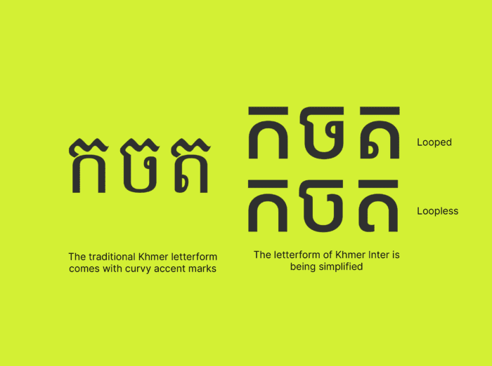
Why we redesigned a typeface for Thai and Cambodian scripts
.
May 3, 2023
.
Regional


About
Consumer
Merchant
Enterprise
Quick Links