Tekan di sini untuk terjemahan Bahasa Melayu
Introducing a new and improved version of the Demand Heat Map. Optimise your productivity and driving hours with this improved feature!
As of September 2019, we added more functions* to this feature:
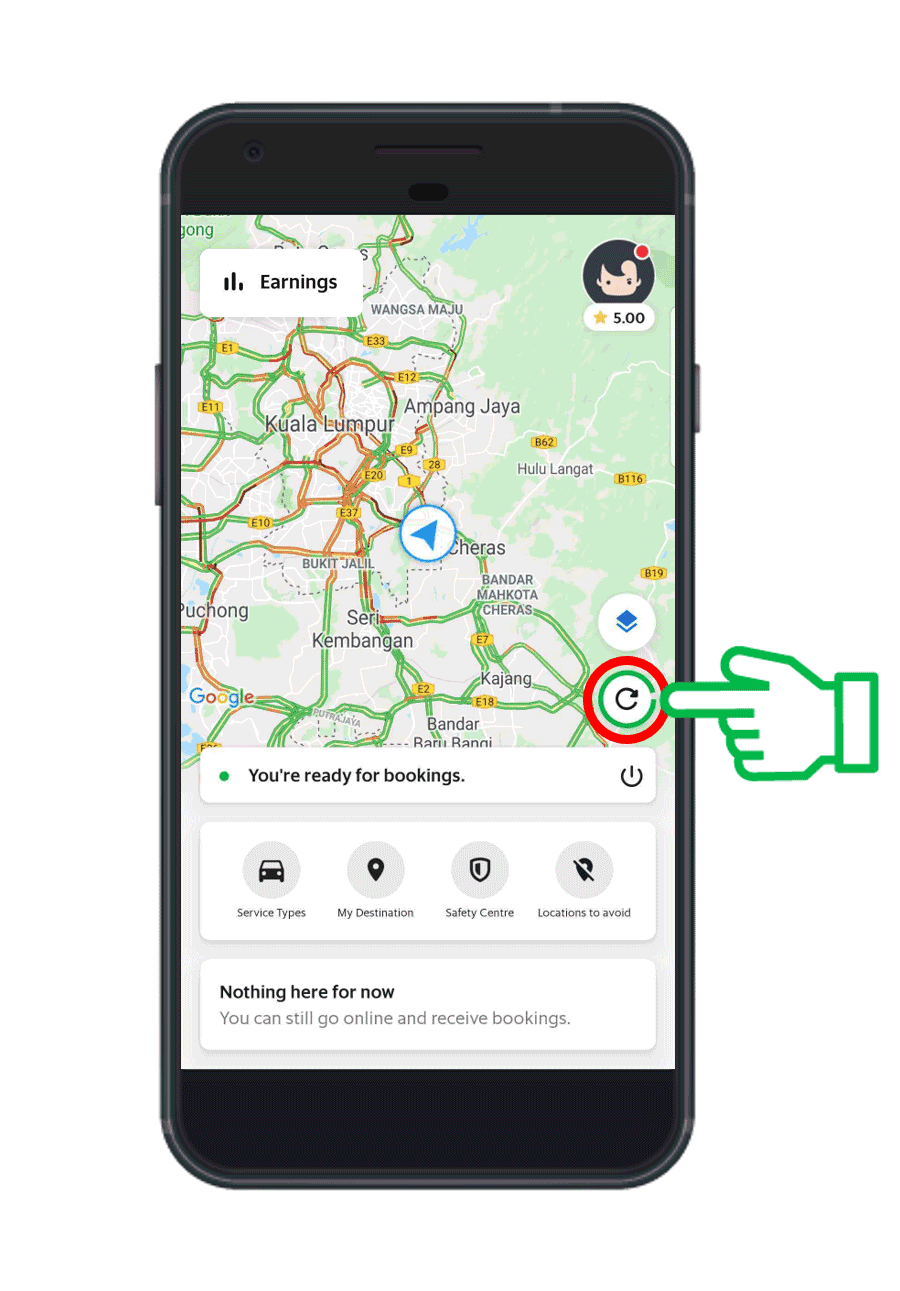
- Added manual refresh button
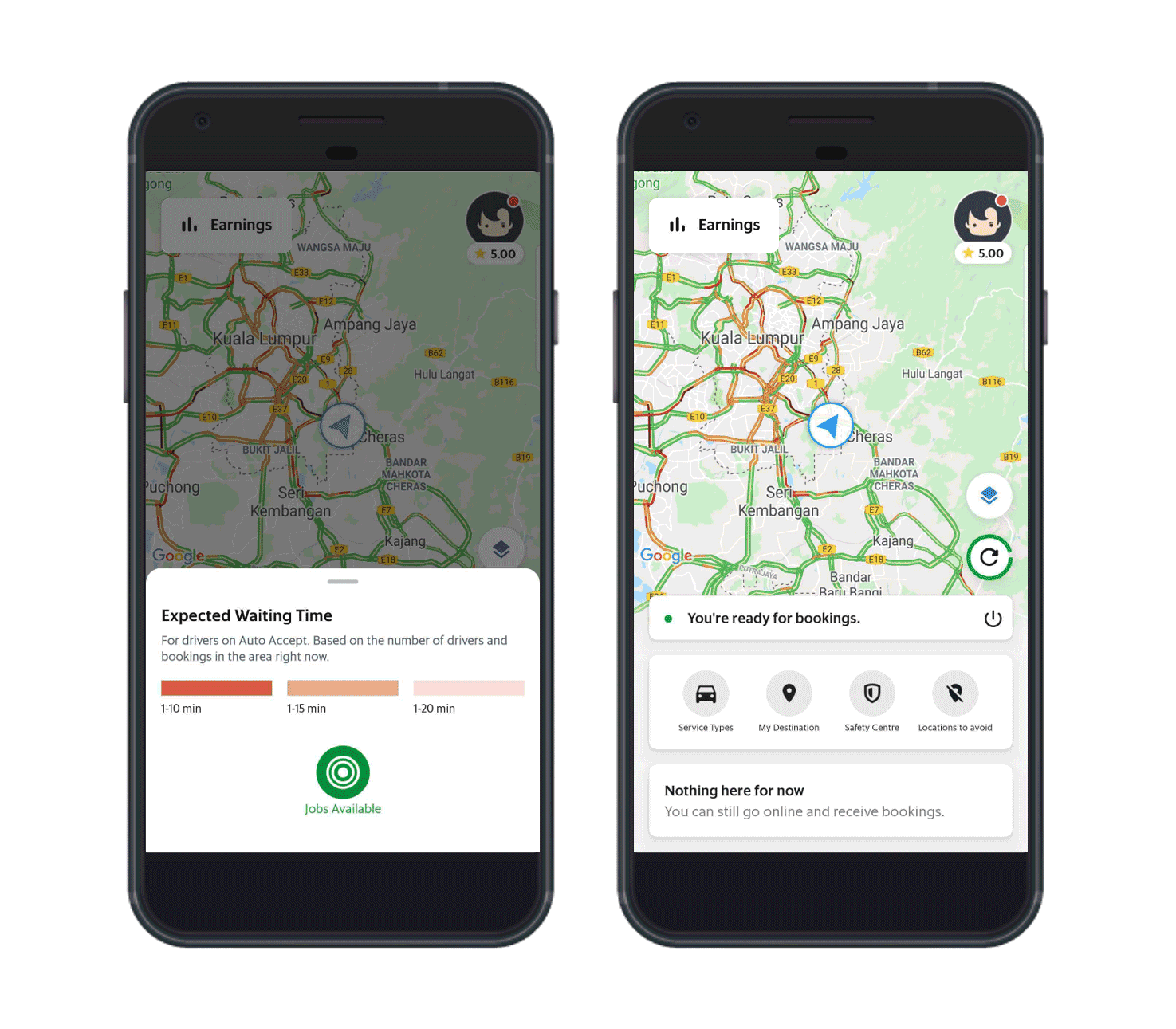
- Estimated waiting time for jobs
*Available to only Klang Valley driver-partners and will be released in stages. We will release this new functions to driver-partners in other cities in the near future.
What’s new with this Heat Map?
1. Simplified Demand Map
Passenger demand is now represented by different shades of red. The darker the area, the more demand there!
(The ‘redness’ of an area DOES NOT represent the fare)

Images are for illustrative purposes only.
2. Zoom and scroll in greater detail
Zoom in on the map, or scroll around to see exactly which areas have higher passenger demand. Know where you want to drive!
3. Manual refresh button for a more real-time update
While the map refreshes automatically every 5 minutes, now you have the option to refresh it manually with just a click of a button.
*Available to only Klang Valley driver-partners on Android. We will release these new functions to Klang Valley driver-partners on iOS soon.

4. Estimated waiting time for jobs
Not only will you know which areas have high passenger demand, you will now know roughly how long you need to wait to receive a job once you’re in that area.

Images are for illustrative purposes only. The time shown in the image will not be the actual estimated waiting time when this function launches.
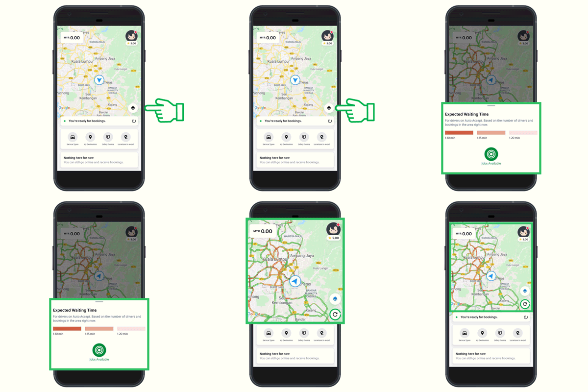
Great! How do I activate it?
Simply follow the instructions below. Tap on ‘Jobs available’ to enable and disable the Demand Heat Map.

Images are for illustrative purposes only.
Frequently Asked Questions
How often does the Demand Heat Map refresh?
The Heat Map refreshes every 5 minutes. As demand increases in an area, you’ll see the shade of red become darker. If the shade of red becomes lighter, demand in the area is decreasing! September 2019 onwards, you will be able to refresh the Demand Heat Map manually.
Will I able to zoom in with this Heat Map?
Yes! Pinch or double tap your screen to zoom into the map. You can also scroll around to check different areas.
Will going to an area with high passenger demand mean I’ll definitely get a job?
We can’t guarantee that you’ll get a job, but going to a high-demand area will definitely increase your chances of getting a job!
Will going to an area with high passenger demand mean I’ll get high-fare jobs?
The Heat Map shows areas with demand-supply imbalance. As such, you may or may not get high-priced jobs in these areas.
Both my friend and I are on the updated Heat Map but we see different high-demand patterns. Why is this so?
The Heat Map shows a combined demand for the different service types you have enabled. To see the same high-demand pattern, please ensure that you and your friend have the same service types enabled.
I tried enabling the Demand Heat Map, but received a pop-up asking me to turn on other service types. Why is this so?
This is because the service type(s) you have currently enabled has insufficient demand. Please enable other service types under ‘Settings’ to see if there is demand for those services.
Kindly be reminded that all members of the Grab community are required to follow the Code of Conduct and Terms of Services.